Increasing activation through a motivation-led onboarding experience
CLIENT
Kandua
PLATFORM
Mobile & Web
YEAR
2023 - 2025
ROLE
Lead Product Designer
RESPONSIBILITIES
User research
Experience strategy
Interaction & content design
Design direction & design systems
In my first year, Kandua had just expanded its marketplace offering for Service Providers into SaaS business tools designed to help them run their businesses more effectively.
The result was a fragmented mobile experience that created friction and lowered activation.
I led the design efforts to unify the experience and improve activation.
To comply with my non-disclosure agreement, I have omitted and obfuscated confidential information in this case study. All information in this case study is my own and does not necessarily reflect the views of Kandua.
Evolution of Onboarding Journey - 2019

Evolution of Onboarding Journey - 2023
Evolution of Onboarding Journey - 2025
My role
I led the redesign of the onboarding experience for the Service Provider mobile app.
Over the three years I worked on this project, I collaborated closely with the founders, a CPO, three Product Managers, and a junior Researcher.
As the onboarding evolved, the business itself went through several changes. This meant I often had to bring new collaborators up to speed and realign the team as we continued improving the tool.
THE CHALLENGE
A fragmented journey
As we introduced the SaaS business tooling, new challenges started to compound that we couldn’t overlook.
The experience became more confusing, amplified by the fact that two product teams owned different parts of the mobile app. Each team focused on their own onboarding flow, and the holistic journey wasn’t fully considered.
Taking a step back
Before redesigning the onboarding journey, I first conducted usability testing and user interviews to understand where the original flow was creating confusion.
A key theme that emerged was the marketplace experience. Many Service Providers weren’t familiar with the model and often complained that they didn’t fully understand how it worked.
Understanding the challenge
Many of these Service Providers were older and not as digitally fluent. A big part of the insight was understanding their mental models so we could design an experience that felt intuitive and gradually built their confidence over time.
This meant rethinking the language we used, the interaction patterns, and the overall visual experience.
Creating the guardrails
I led several workshops with the founders, PMs from both teams, and a technical lead. The outcome was a shared set of three guiding principles to anchor the journey:
Help Service Providers understand how Kandua works
Manage expectations early
Get them to a Moment of Truth faster
Onboarding journey map from a design workshop
These principles were also informed by competitor analysis and consistent patterns observed in successful onboarding experiences across other digital products.
THE RESULT – 2023 REDESIGN
A simplified onboarding journey that reduced confusion and increased motivation
The product was broken into clear, action-based steps within the onboarding flow, with each action directing users to a specific part of the product.
This reduced early confusion and helped users build a mental model of how the system works.
A short explanatory carousel addressed the biggest misunderstandings identified during research.
Early in the marketplace journey, Pros reached a moment of delight by seeing available jobs, which created enough motivation to carry them through the more effortful steps.
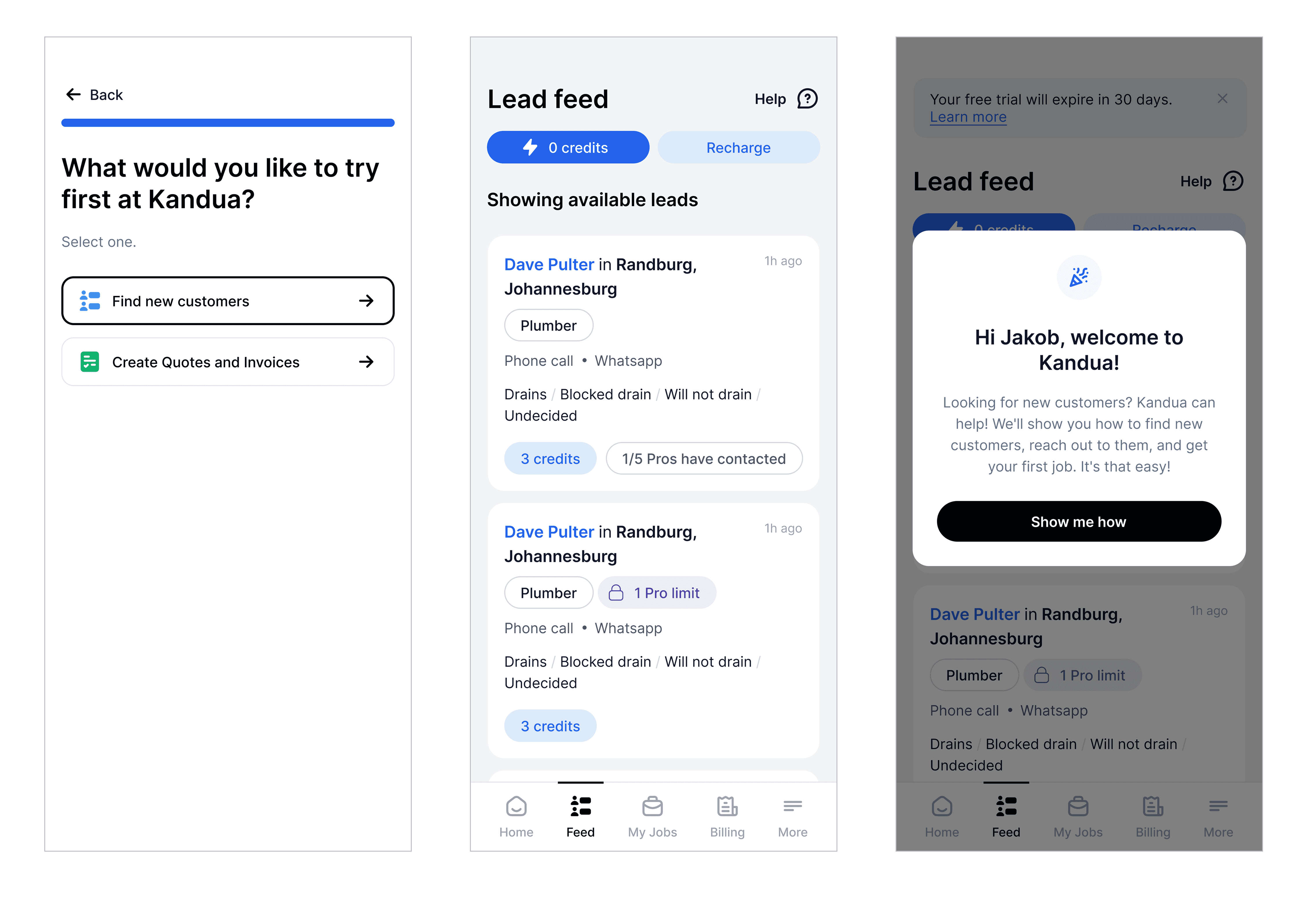
Service Providers got a quick glimpse of available jobs before the modal prompted them to engage with the carousel.
After viewing jobs, Pros moved into verification with much higher intent, since they now understood the value of completing those steps.
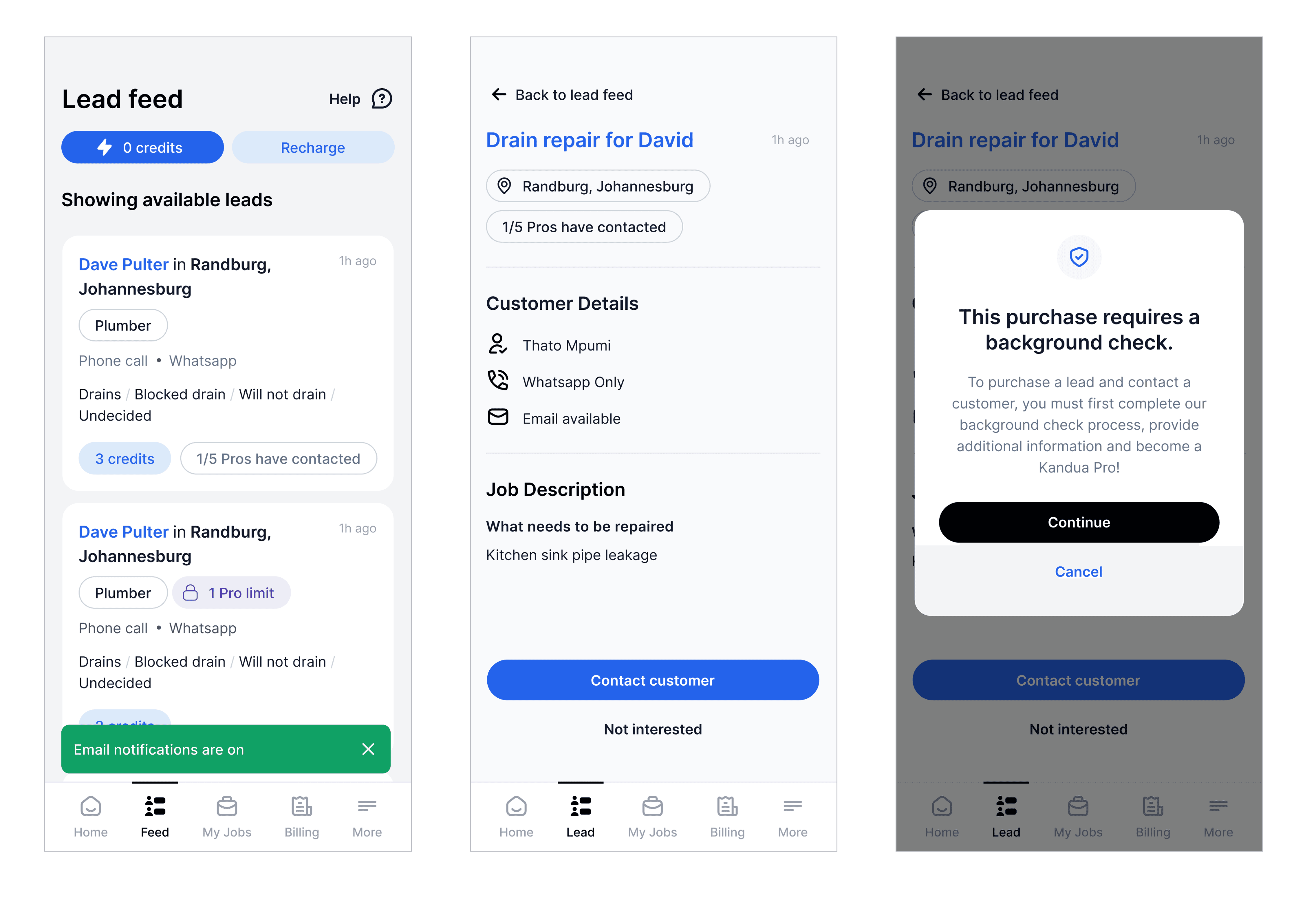
Service Providers couldn’t contact customers until they completed the background check.
Saas Onboarding
The same principles used in the marketplace journey were applied to the SaaS experience.
The explanatory carousel was used to manage expectations and provide clearer context around the SaaS offering
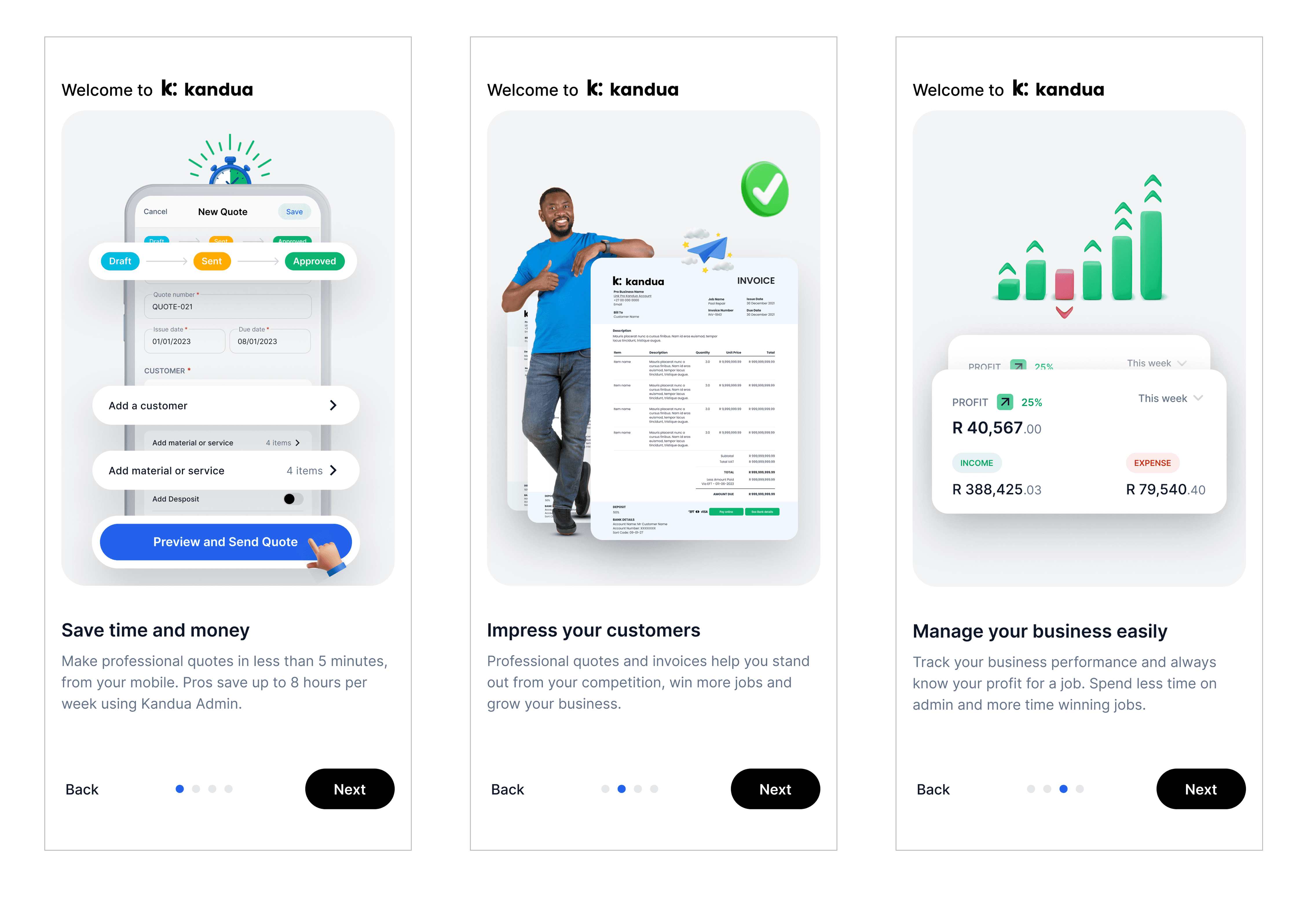
A product tour showed new Service Providers how to use the business tool – quotes and invoices.
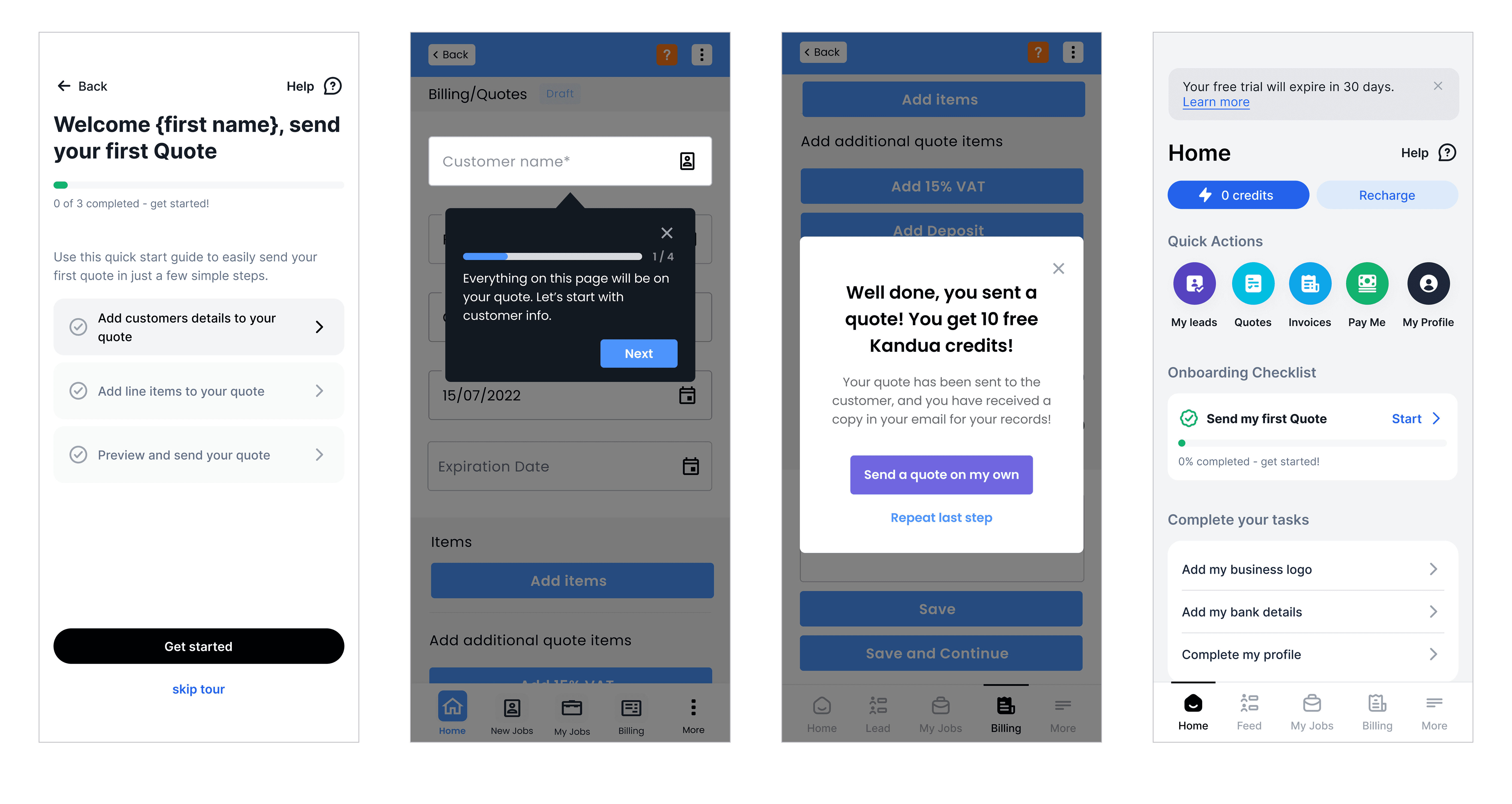
Service Providers received an incentive to send their first quote after completing the tour.
The outcome
The redesigned onboarding flow led to 88% completion rate from the registration screen to completing the background check — far higher than the previous experience.
For confidentiality reasons I have omitted the actual values for this metric.
HOW WE GOT HERE
Building the journey
I built the onboarding journey around a three-phased motivational model. Each phase addressed different detractors that could cause Pros to drop off.
Set expectations
When the design explains why something matters before diving into the details, it naturally creates momentum, making the journey feel inevitable and worthwhile.
Goal for this stage was to remove the early confusions by clearly explaining the model and value proposition.
Build early momentum
When people feel like they’ve achieved something, they’re more likely to keep going. A small win makes you feel good, and that feeling nudges you to do the thing again.
Goal for this stage was to sustain motivation through small wins and early moments of delight.
Drive toward action
In games, getting someone to try something once isn’t that hard. The real trick is getting them to come back.
Goal for this stage was to leverage gamification elements to convert motivation into meaningful action.
A unified design language
Early research showed that the fragmented visual experience contributed to the confusion. Interaction patterns were inconsistent, which led to a non-intuitive experience.
I designed an updated design language to modernise the visual experience and address the interaction challenges we had identified.
Some examples of the updated visual language: Home screen (top), Job screen (bottom).
Due to capacity constraints, we couldn’t fully roll it out across every product and feature. We were a startup, and other projects needed to be prioritised.
Nevertheless, I had other opportunities to scale the design language as the product evolved.
Scaling the design language and evolving onboarding after acquisition
As the updated design language matured, I continued to scale it across more areas of the product. Each new feature or improvement became an opportunity to bring more consistency to the experience, even if we couldn’t apply it everywhere at once due to capacity constraints.
Old profile screen (left), proposed improvement (middle), final shipped version (right)
This work became even more important after our acquisition. The onboarding journey now had to meet new compliance requirements, which meant revisiting the flow once again.
The challenge was to integrate these additional steps in a way that still felt clear, guided, and aligned with the design principles we had already established.
THE RESULT - 2025 REDESIGN
A level-based onboarding journey where Pros earned a badge for each level completed
Levels increased in difficulty, similar to games, to sustain motivation. Each level included “carrots” — incentives that motivated them to continue (e.g., seeing their public profile, accessing jobs)

Progress bars in each level managed expectations and ensured Pros always knew how far they had progressed.
For longer steps or stages, explainer pages managed expectations so Pros never felt surprised or overwhelmed by what came next.
I evolved the design language and, this time, scaled it across all our products and features.
BEYOND ONBOARDING
Enabling faster vetting with an improved internal tool
The redesign went beyond the onboarding experience. I also designed an internal tool that helped our teams review and vet Service Providers more efficiently.
The tool allowed teams to approve, reject, or request additional information without needing to contact the Service Provider unless it was necessary.
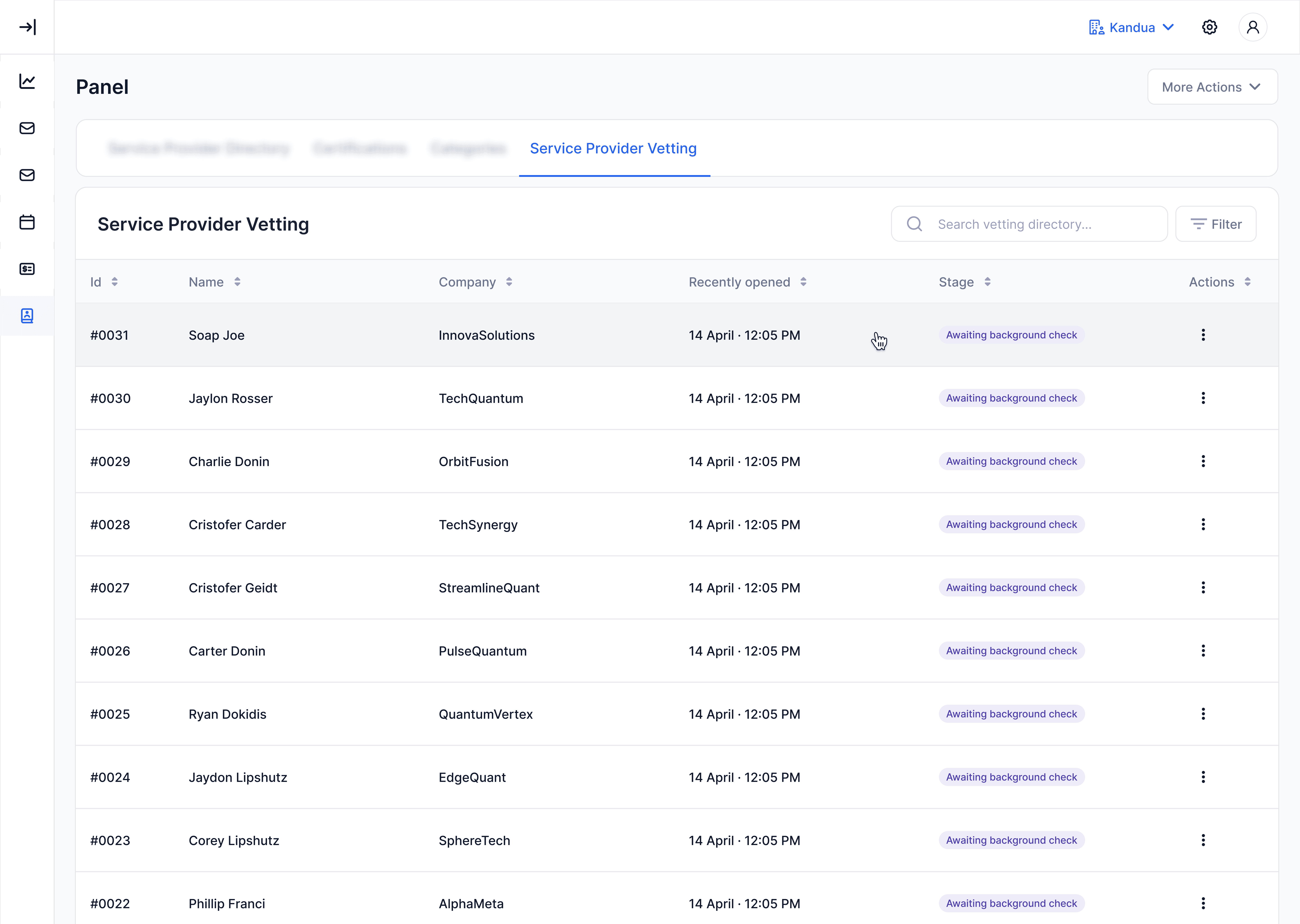
A Service Provider table that allows the team to track which Pros have completed their onboarding stages.
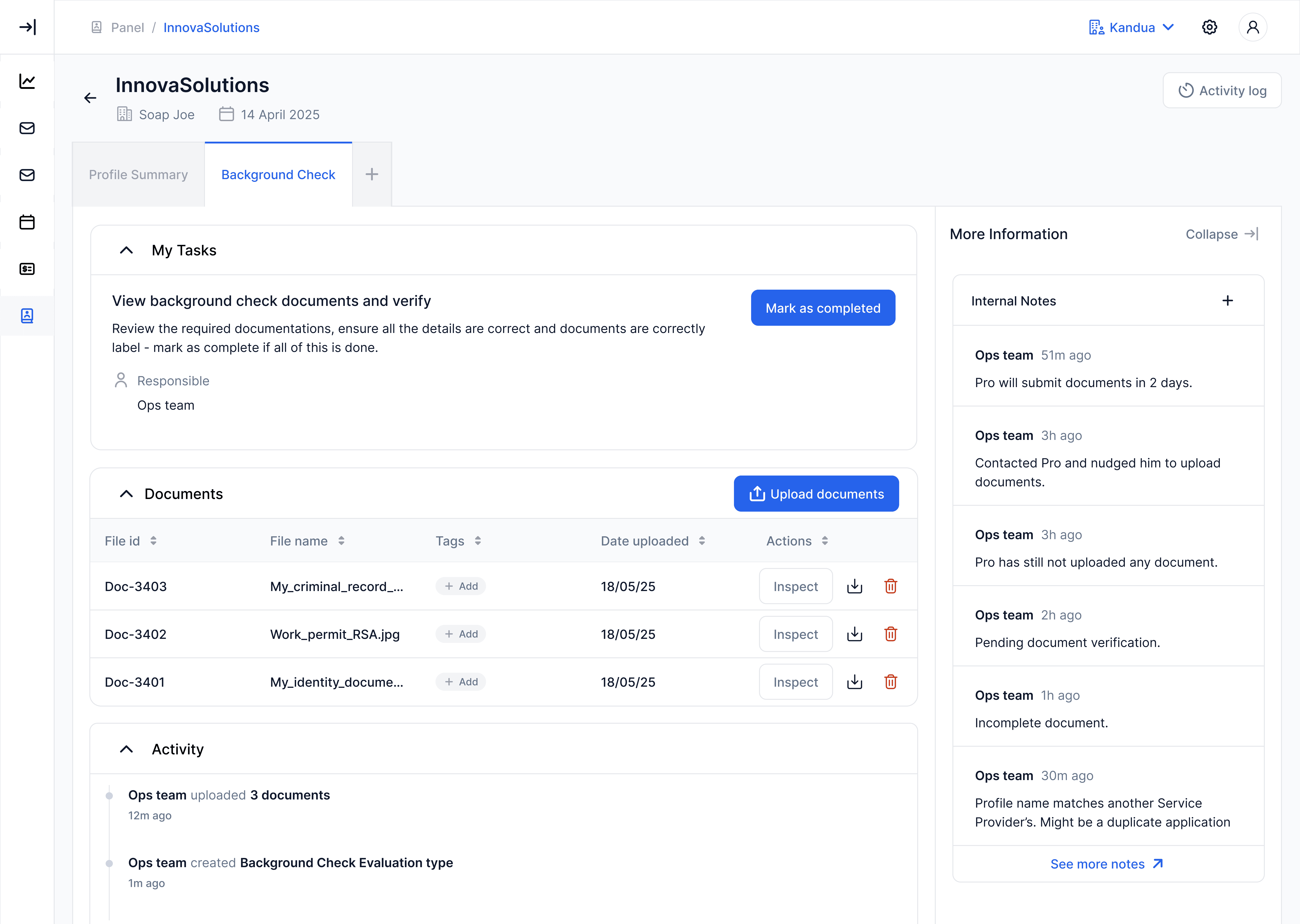
A page that allows the team to review and verify the Service Provider’s submitted details and documents.
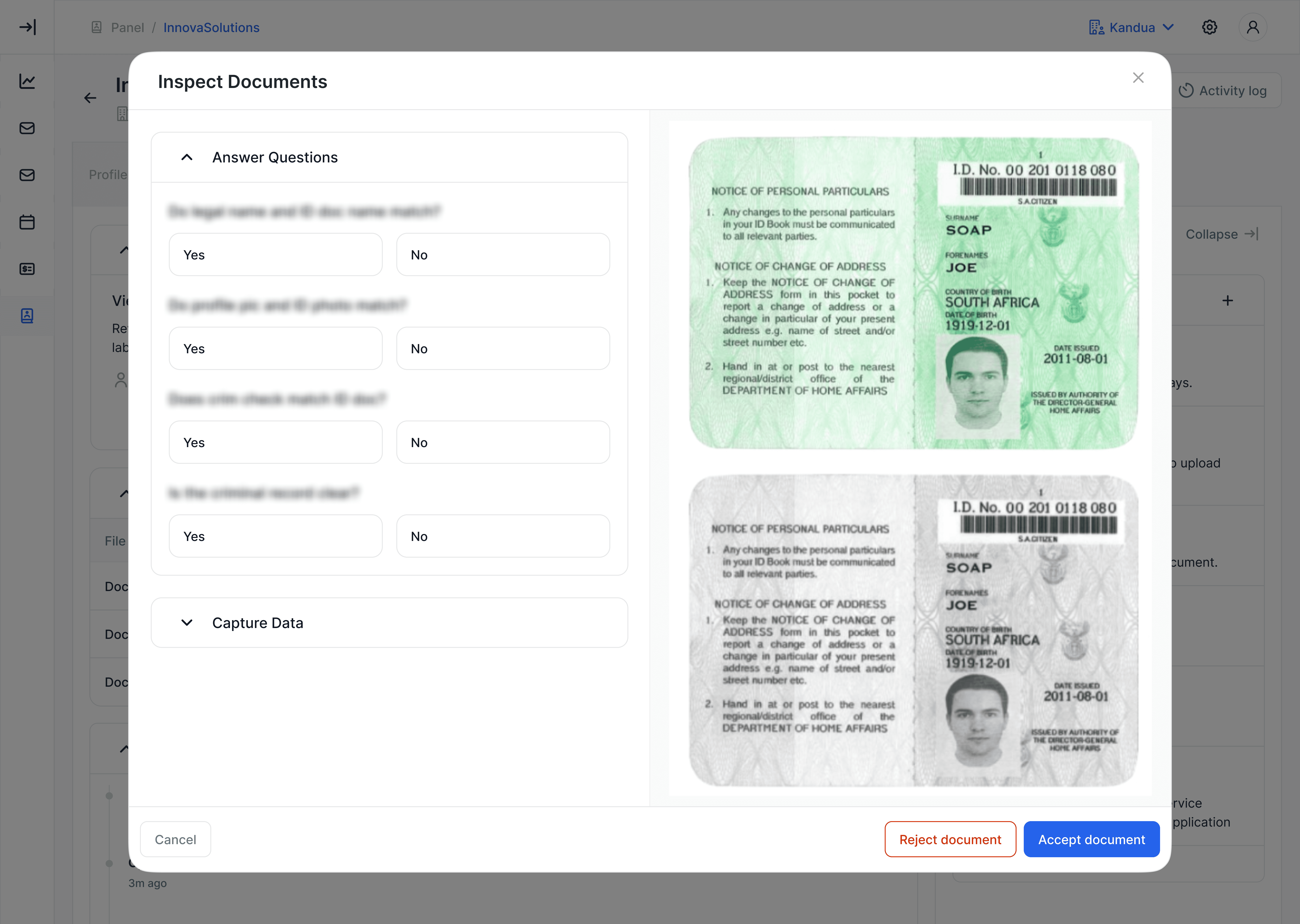
The team can view documents and capture the relevant data to accept or reject the information provided by the Service Provider.
The impact
At the time of writing, the updated mobile app had launched to a smaller set of our Pros. Early feedback has been encouraging, with many Pros complimenting the new experience and committing to complete their onboarding.
Reflections
Over the course of working with Service Providers, I developed a deep understanding of their nuances, motivations, and mental models. This was useful for redesigning onboarding and it became the foundation for how we shaped the entire product experience for the segment.
As the company evolved, especially after the merger, the environment around the work changed quickly. The work needed to scale across teams and fit into a much larger picture.
A significant part of my role became aligning leaders around the value of a cohesive experience and the downstream impact on activation, retention, and operational efficiency. As a result, I created demo videos using the updated design language, which helped leaders and teams see what was possible and motivated the business to support the direction.
In the end, the onboarding redesign was only one output. The bigger impact was creating clarity, building alignment, and helping the company move toward a more cohesive and enabling experience for Service Providers.
